IN WHICH I GEEK OUT ABOUT THE SYMPTOMS COVER
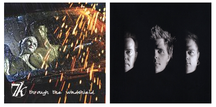
My friend Curtis once said, “I’m not rich, but I have rich tastes.” That’s how I feel about good visual design. I can’t do it—but I know it when I see it. [Samuel L. Jackson voice]: Example. I designed the CD cover for my band’s first full-length album, Through The Windshield (below left), but had my friend Paul Rivera (brilliant photographer/designer) design the one for our final album, 7k (below right).
You can see the difference. Another example: I designed my first website (which, mercifully, I don’t have a screenshot of) and had the geniuses at Agency 689 design this one. I LIKE ART; I just can’t make it. I suppose my art is words, but I only figured that out recently.
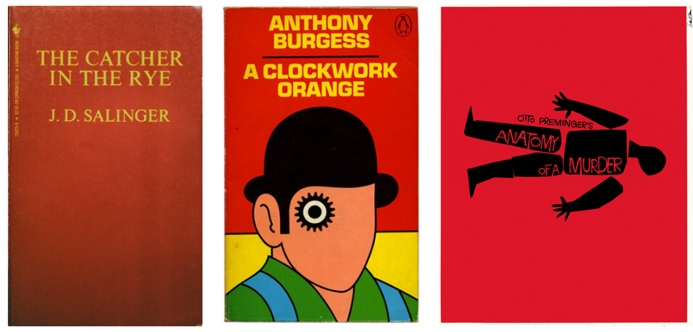
So, when my editor at HarperCollins, the amazing Kristin Rens, sent me the concept art for the cover of SYMPTOMS, I was completely floored. I thought immediately of The Catcher in the Rye. Of A Clockwork Orange. I thought of old Saul Bass movie posters.

I thought: this is the cover. I’m unashamed to tell you I wept on the phone with my agent as I was looking at the cover.
“I’m unashamed to tell you I wept on the phone with my agent as I was looking at the cover.”
It just made things so real, you know? Because this whole publishing experience has been surreal. It’s like this: I’ve been trying to do… something since I was 15. Starting with my very first acting job (as Furman on The Wonder Years), through my film school experience, and then through ten plus years with my band. It felt like a lot of knocking and very few opening doors. Don’t get me wrong; there’s been validation. Guest stars on big shows. Two national tours. Getting mistaken for Jon Bon Jovi at a truck stop in Joplin, Missouri. But when I finally saw Sarah Kaufman’s cover design for SYMPTOMS, everything seemed to converge in that moment. Decades of thrashing in the void, trying to create something that might penetrate that mysterious gelatinous barrier between hobby and profession, something that could cross the street without getting run over at the intersection of art and commerce—and it all seemed to come down to that moment, staring at that image on the screen, the cover for SYMPTOMS. It was real. It sounds dramatic, but it’s true.

So yeah, I wept. Shut up.
But back to the cover. The trend for covers in YA seems to be photo-realistic depictions of attractive young people in various states of adventure or distress. I don’t begrudge designers this trend; after all, if you want people to read your book, you have to motivate them to pull it off the shelf and open it. Cover design is, to me, a mysterious alchemy of art and marketing, and I stand in awe of it. But because of this trend, I was very nervous about what approach HarperCollins would take in designing my cover. How could the cover represent Riley without biasing the potential reader toward gender? And then I saw what designer Sarah Kaufman had created, and I was blown away. A simple, iconic image mixed with striking typography. Somehow she delivered exactly what I wanted but could not have imagined. And then I found out that the green and purple colors she used are part of the genderqueer flag designed by Marilyn Roxie in 2011.

(AND, Sarah reveals even more design secrets in her blog post here, which I recommend you read immediately upon finishing this post. And while you’re at it, check out this video interview with Sarah on Epic Reads.)
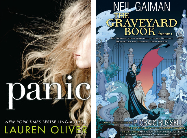
So naturally I found Ms. Kaufman online and discovered that not only did she design the cover for Lauren Oliver’s PANIC, but also for Neil Gaiman’s THE GRAVEYARD BOOK graphic novels. Needless to say, I am inspired and humbled to be in such company.

While I haven’t yet met Sarah in person, we share a love of music, and in particular for Mr. Bowie. When I found this out, I dug up an old photo from the 7k archives and pasted it next to Mr. Bowie to surprising effect.
I will now leave you with this final image:

Dance, magic dance. And don’t forget to ENTER TO WIN an Advance Reader Copy of SYPTOMS from YABooksCentral.com. You can also preorder on Amazon and HarperCollins.com
